Restaurant management dashboard
A smart dashboard designed to simplify restaurant management
ROLE
UX Designer
EXPERTISE
UX/UI Design
YEAR
2024

DineBoard focuses on enhancing the restaurant management experience by designing a user-centered dashboard. By understanding the needs and pain points of restaurant managers, we aim to create a tool that is intuitive, efficient, and enjoyable to use. The dashboard will prioritize data visualization, personalization, and a clean, uncluttered interface to help managers quickly grasp key insights and take action.
Timeline
From explorations to final designs in 5 weeks while working with multiple projects at the same time
This category details the step-by-step approach taken during the project, including research, planning, design, development, testing, and optimization phases.
Research & Planning
Conducted market research to identify existing scheduling challenges and user preferences. Defined target audience segments and outlined key features based on user needs and market trends.
Design & Prototyping
Collaborated with designers to create intuitive user interfaces and interactive prototypes. Iteratively refined designs based on user feedback to enhance usability and visual appeal.
Implementation
Leveraged agile development methodologies to build the scheduling app from the ground up. Prioritized feature development based on user feedback and technical feasibility. Implemented AI algorithms to analyze user behavior and optimize scheduling recommendations.
Testing & Optimization
Conducted rigorous testing across various devices and platforms to ensure compatibility and performance. Gathered user feedback through beta testing and iteratively optimized the app based on usability metrics and user satisfaction.
Turning restaurant data into clear, actionable insights
Centralized Dashboard Experience
Designed a unified dashboard that brings all key restaurant metrics—sales, orders, and performance—into one clear, accessible view.
Data-Driven Visualization
Implemented intuitive charts and visual indicators to help managers quickly understand trends, peak hours, and performance insights.
Smart Filtering & Personalization
Enabled filters by time, category, and location, allowing users to customize views based on their specific needs.
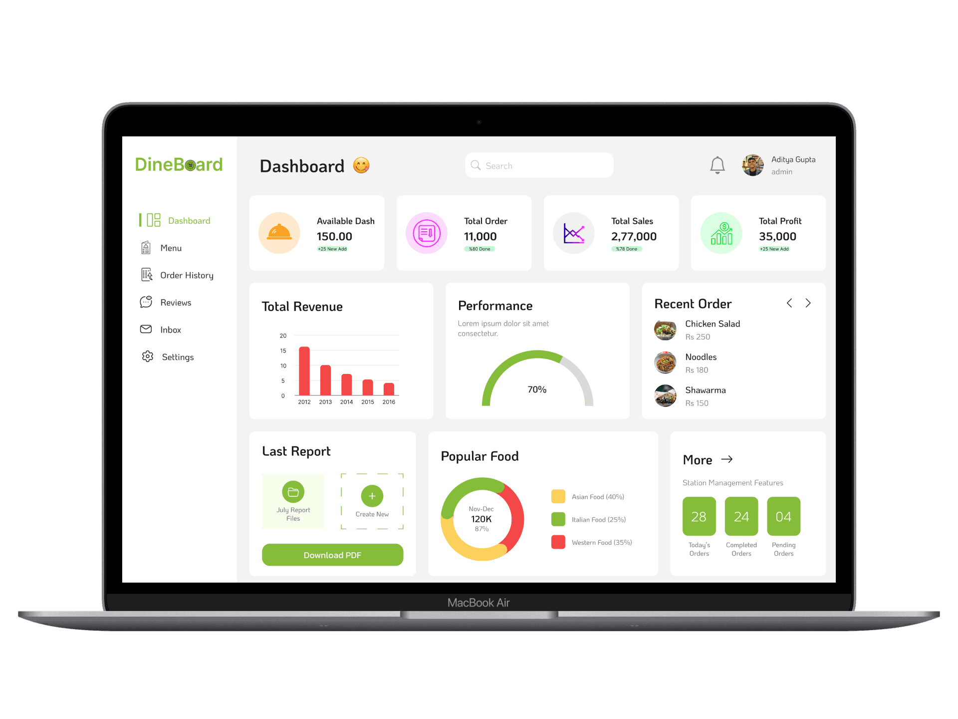

Here, the outcomes and achievements of the project are highlighted, including user feedback, adoption rates, and industry recognition.
Faster Decision-Making
Managers were able to quickly identify trends and performance issues through clear data visualization, reducing time spent analyzing reports.
Improved Operational Efficiency
Centralized insights and smart filters streamlined daily workflows, helping teams manage operations more effectively.
Enhanced Data Accessibility
Complex restaurant data was transformed into an intuitive dashboard, making key insights easily accessible to all users.